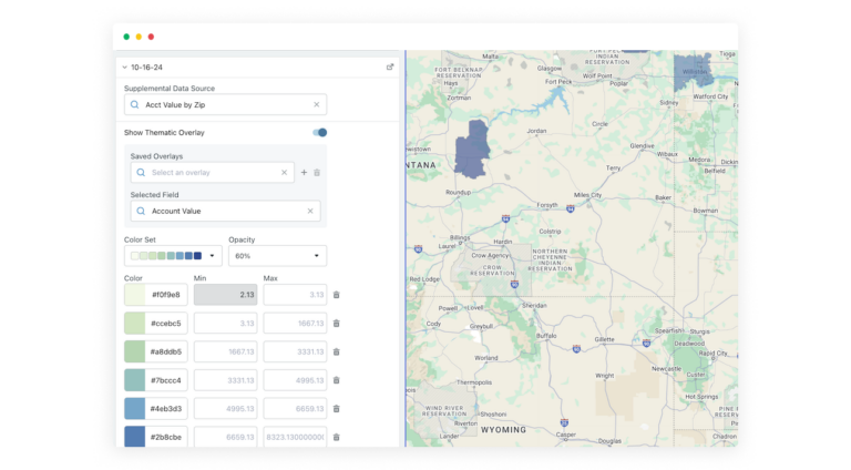
Data tells a story—but raw numbers on a spreadsheet don’t always make that story clear. Thematic Maps in Territory Planner bring your data to life with color-coded overlays, making it easy to spot trends, compare regions, and make smarter territory decisions.
Understanding where your key data points are concentrated is just as important as knowing what they are. With Thematic Maps, you can:
How It Works
Today, Thematic Maps in Territory Planner work exclusively with Supplemental Data, allowing you to overlay shape-based data on your model for a clearer geographic perspective.
To learn more about Data Visualization on Thematic Maps, visit our help site.
Build, balance, and optimize your territories in minutes.