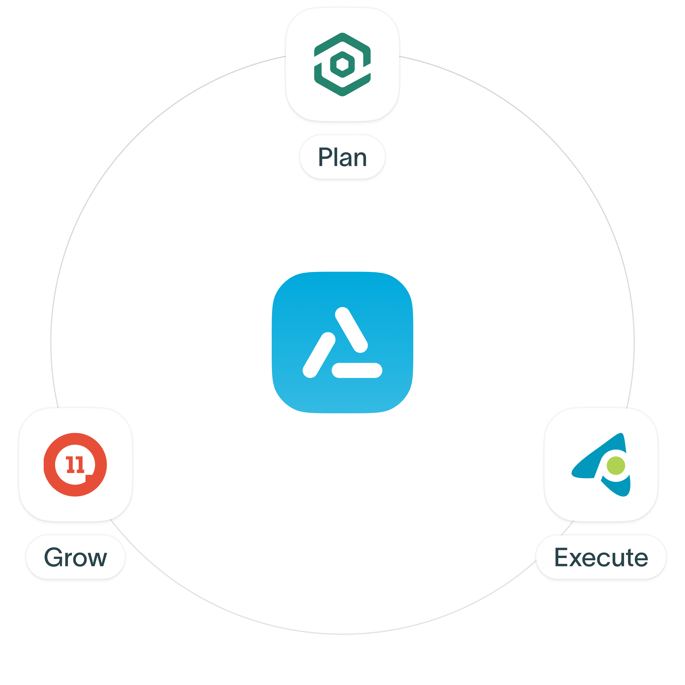
Ascent Cloud helps sales teams Plan, Execute, and Grow through a unified Sales Performance Management suite that connects strategy, action, and results.

Trusted by modern enterprise sales teams


Three solutions. One unified sales performance system.
Start with the solution you need today, then connect the suite to plan smarter, execute faster, and grow performance with consistent visibility.


Territory Planner
Model and optimize territories with flexible GTM planning tools that align Sales, RevOps, and Finance—without spreadsheets.


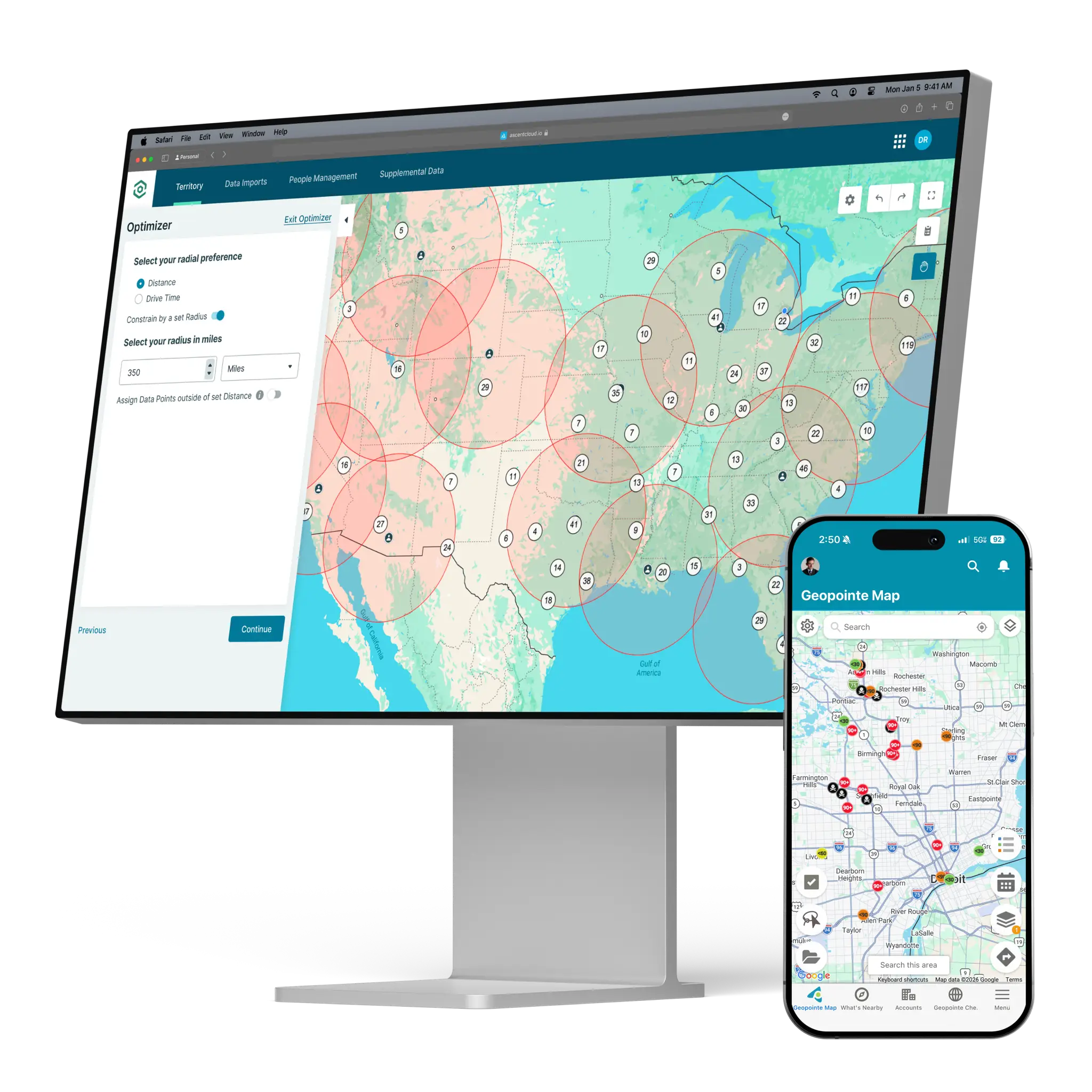
Geopointe
Use location intelligence to help sellers prioritize accounts, reduce travel time, and maximize coverage and productivity in the field.


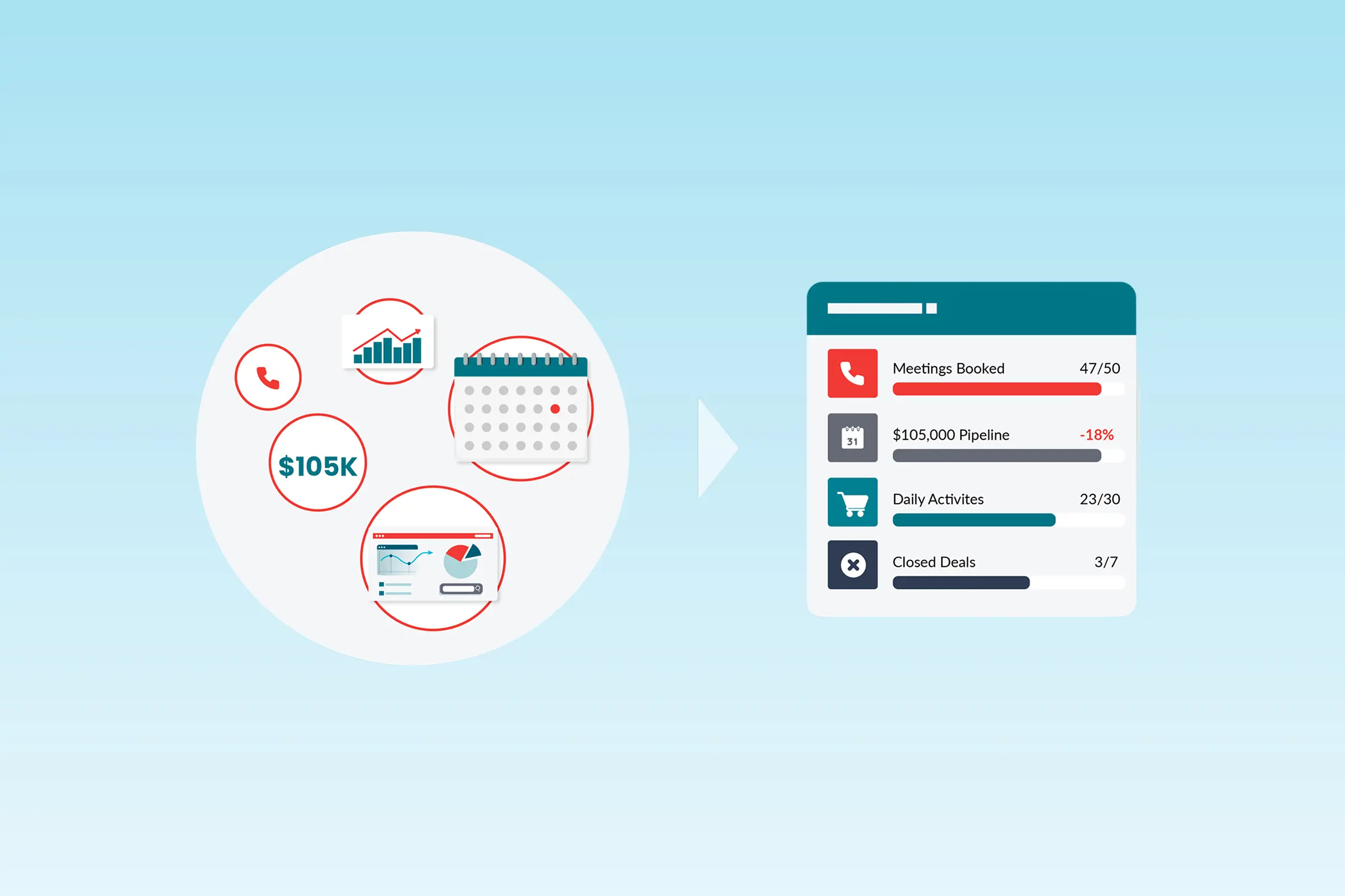
LevelEleven
Drive consistent performance with gamification, scorecards, and coaching insights that turn activity into outcomes managers can act on.

Trusted by sales leaders to turn execution into outcomes.
From RevOps to frontline leaders, we help organizations plan smarter, execute faster, and grow performance.

Increase in sales productivity
“You can set up a contest in minutes. And that, to me, was huge. Working in a big company, things sometimes can take a long time to get done.”

Uptick in sales call conversions
“We use Geopointe to name drop current customers in a prospect’s area while we have that prospect on the phone – call conversions are up 50%.”

Reduction in marketing campaign costs
“Every single person on my team wakes up and uses Geopointe on an almost-daily basis.”

“LevelEleven is an incredibly effective way to refine performance and maintain team morale.”

Faster comp analysis
"Geopointe halves the time it would take us to pull a targeted list of comparable properties when we are doing rental comps."

field sales team users
We are extremely satisfied with L11 and the support of Ascent Cloud. It has transformed how we measure, motivate, and manage our sales team.

Built to stand alone.
Designed to work together.
When Territory Planner, Geopointe, and LevelEleven work together, planning decisions flow directly into field execution, and performance data feeds back into smarter decisions.

Plans impact the field, execution signals become coaching, and performance changes flow back into strategy
Made for the people
who run sales.
Choose your role to see how Ascent Cloud supports your workflows with clearer visibility, tighter alignment, and tools that fit how your team actually runs sales.
We’re in the business of growing businesses.
See why sales teams choose Ascent Cloud, roll out fast, and keep in their stack as they scale.

Insights for modern sales teams.
Practical guidance, real-world examples,
and expert perspectives.


Thank you
We’ve received your message and a member of our team will be in touch shortly.
See customer results
Guides, insights & events


